Project overview


The product:
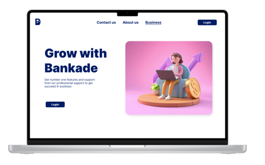
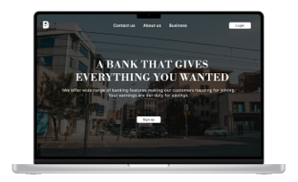
Banakade is online banking app which allows customer to select, set up and manage the personal bank account without visiting in person


Project duration:
Around 3 to 4 months
November 2023 - February 2024


The problem:
Users were having issues to find convenient way to manage their banking account without actually visiting bank
The goal:
To facilitate user with different banking management features within a website so they can access, update and manage their account from anywhere


My role:
UI/UX student & intern, Intermediate graphics designer
Responsibilities:
Developing site structure, user research, wireframing, prototyping, usability testing, etc. I am doing this project by myself
Understanding the user
User research
Personas
Problem statement
User research: summary

The primary users found via user research were young adults who were not willing to go to bank and wait in queue for their banking process. They were searching for simple and easy method that allows them to send, receive, update and manage their bank account without going to bank.
Some people were frustrated when bank ask to fill up forms for their additional information. This was creating problem for those who were in rush for their work and has no time for it. They want to provide all required information before creating account and don’t want any interruption during their banking process
User research: Pain points


Distance
Time
Facility
Users were having issue to manage their account when they are far from physical bank
Users have no time for waiting in queue for their banking procedures
Availability of fewer banks that supports online banking throughout the world
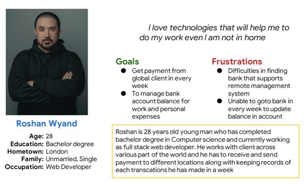
Persona: Roshan
Problem statement:
Roshan is a full stack web developer
who needs remote banking system
because he need to send and receive payment from different part of world
Starting the design
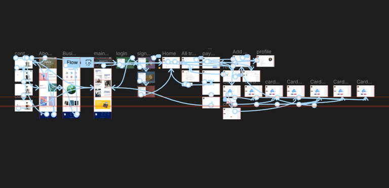
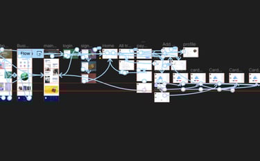
Sitemap
Paper wireframes
Digital wireframes
Low-fidelity prototype
Usability study
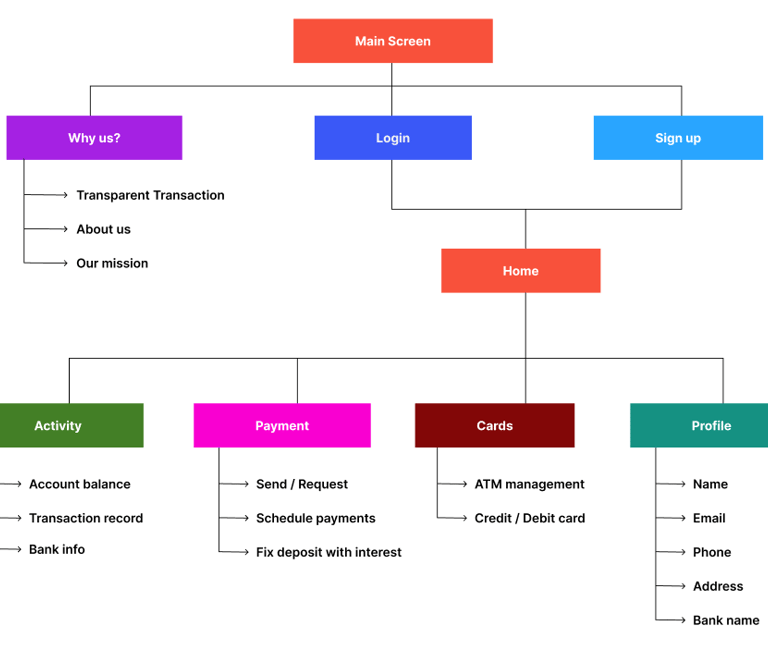
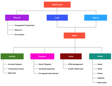
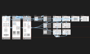
Sitemap
Users are able to move through several steps followed by Signup or login page and reach to initial home page of website through which all necessary features can be accessed for mobile banking
Paper Wireframe
The wireframes are initially designed on paper to brainstorm ideas about the interface that the user face while opening the website in computer or in mobile screen
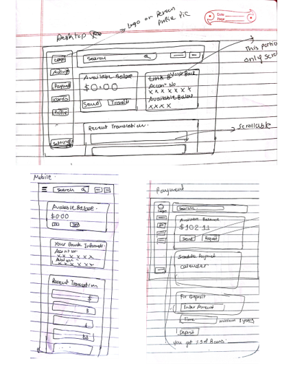
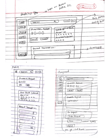
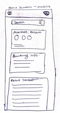
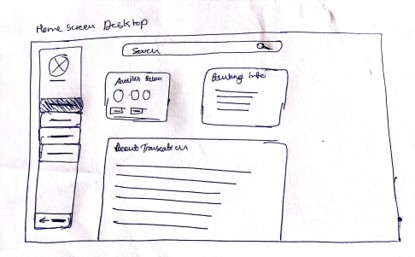
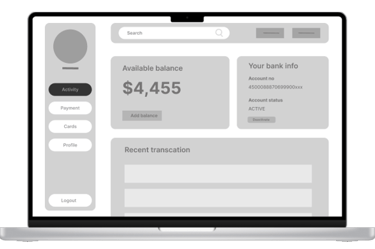
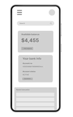
Paper Wireframe screen size variations
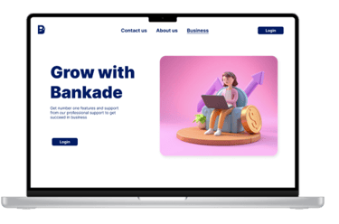
The pages were designed according to different device screen as shown in image, home page for desktop and mobile screen

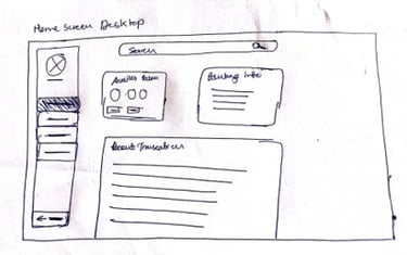
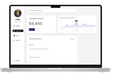
Digital Wireframe
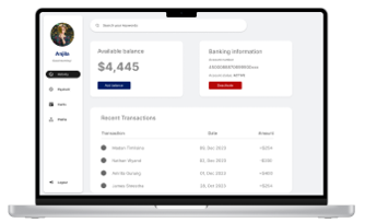
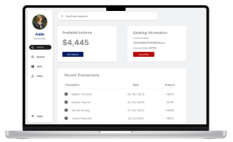
Moving on, I made design in such a way that, users can track their transactions, balance and move to different section of pages through constant navigation bar
Allows users to navigate different sections of page
Allows users to see all the transactions they have made
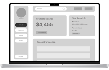
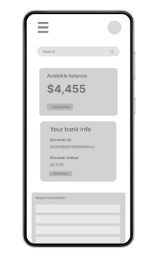
Digital Wireframe Screen size variations
The look of digital wireframe is different on different devices as shown in image about how it looks in mobile and in laptop screen
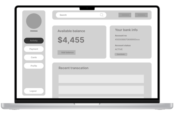
Low- Fidelity prototype
Low fidelity prototype addressing the primary user need for performing online transaction without going to physical bank
View Bankade: Low-Fidelity prototype

User research: Findings
Moving back
Logout issue
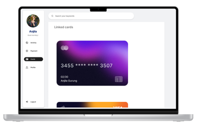
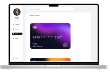
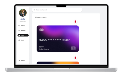
Delete cards
Once user move from one page to another, they were facing problem for moving back to previous page
User wanted to logout when they complete their work, but there was no option for logging out from website
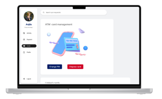
Users wanted to delete their previous cards linked with website, but they were not able to do in website


Refining the design
Mockups
High-Fidelity prototype
Accessibility
Mockups
Back buttons have been added to almost every page of the site to facilitate easy navigation between different pages when moving forward and backward.
Before usability study
After usability study
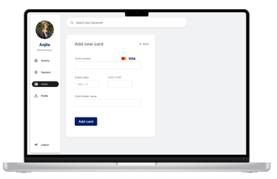
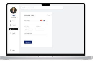
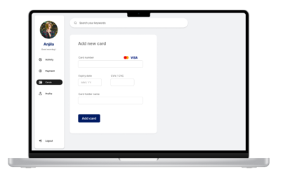
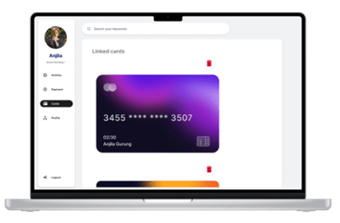
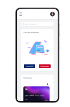
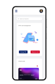
Back button is added at the top of cards menu
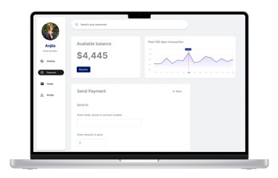
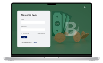
The logout button was added after usability study through which user can log out their account from any page as it is fixed on navigation bar
Before usability study
After usability study
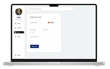
There was no button for deleting unwanted card from their account so delete button was added through which users can delete their card and later add another one
Before usability study
After usability study

Mockups: Original screen size


Mockups: Screen size variations


High-Fidelity prototype
Along with main user flow, other necessary navigations were also added, and the design was refined after usability study
Link to prototype: High-fidelity prototype
Accessibility consideration


There is constant navigation bar which allows user to move easily to any of page of website without facing any issues
Vivid color contrasts were strategically employed to enhance the distinction between text and background, facilitating seamless readability and promoting effortless transition to alternate pages.
Forms are clearly labeled, indicating the required information for input, promoting ease of use and accessibility.
Thanks for reviewing