Trendy Florist case study
Madan Timilsina
Anisa Gurung
Roshan Sharma
Lisa Magar
Ashish Darai
Jasmin Gurung
Project overview


The product:
TrendyFlorist is designed for the users who are interested to buy floral product through their mobile phone residing anywhere. It aims to target flower enthusiast people


Project duration:
Around 4 months
February 3, 2024 – May 25, 2024


The problem:
Issues in ordering different pieces of flowers according to their choices from different location
The goal:
- To solve user problem for ordering flowers from any places.
- To give users more freedom to choose from different variety of flowers


Our roles in project:
Researchers & designers
Responsibilities:
User research, wireframing, prototyping, usability testing and so on.
Understanding the user
User research
Personas
Problem statement
User journey maps
User research: summary

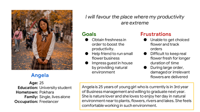
We have conducted interviews and created empathy maps to understand the users we are designing for and their needs. A primary user group identified through research was young students who likes to work in clean and fresh environment where they can boost their productivity and creativity
As of my assumptions, users need flowers to decorate their home and garden only, but research revealed that flowers can create beautiful environment where person is living as well as can impress anyone who encounter that place. We also found that users are having issues to get flowers according to their choice in local stores and also are frustrated when the large orders are completely out of place and unacceptable
User research: Pain points


Time
Choice
Navigation
Orders
University students are often busy to buy flowers from their local shop
Local stores don’t consist of flowers according to choice of students
Difficult to navigate checkout process and user choice payment methods
Unable to track the orders status and updates
Persona: Angela
Problem statement:
Angela is a freelancer and busy university student in business management who needs variety of flowers and plants because she want to boost her productivity in fresh environment

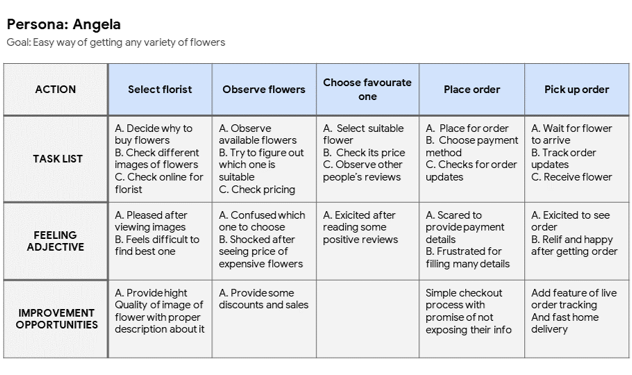
User journey map
Mapping Angela’s user journey map revealed that how helpful will be for user to order any variety of flowers according to their choice sitting in home using florist app

Starting the design
Paper wireframes
Digital wireframes
Low-Fidelity prototype
Usability study
Paper Wireframe
Taking the time to draft iterations of each screen of the app on paper ensured that made it to digital wireframe would be well suited to address user pain point. For the home screen, we prioritized user choice letting them to choose flowers
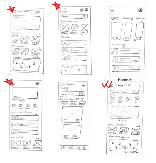
Stars were used to mark the element of each sketch that would be used in initial digital wireframe
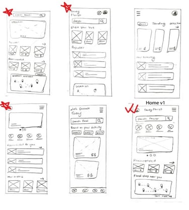
Digital Wireframe
Taking the time to draft iterations of each screen of the app on paper ensured that made it to digital wireframe would be well suited to address user pain point. For the home screen, we prioritized user choice letting them to choose flowers
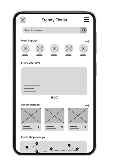
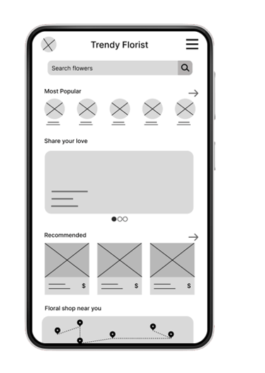
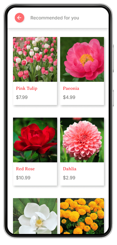
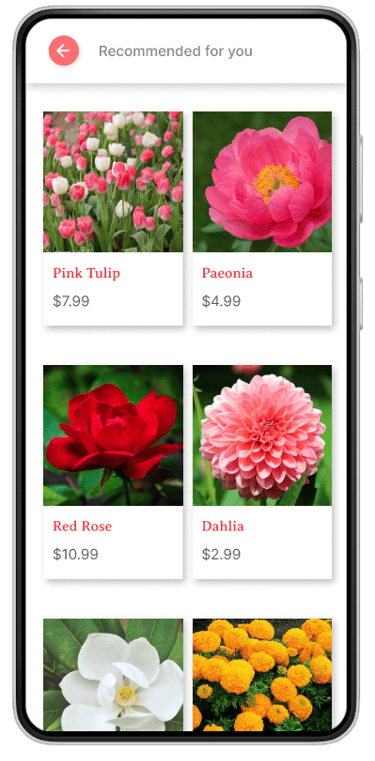
This option allows user to choose variety of trending flowers
This allows user to purchase based on their recent activities
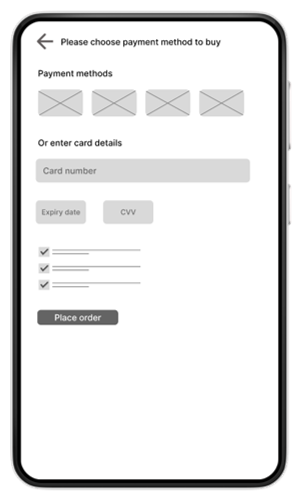

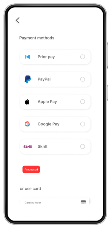
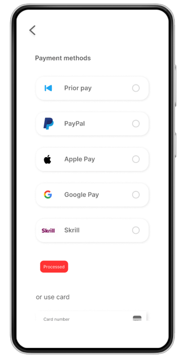
Easy checkout process was key user need to address in designs in order to equip the app to work smoothly during payment procedure
Users can choose digital wallets to pay
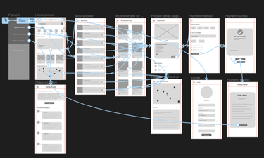
Low- Fidelity prototype
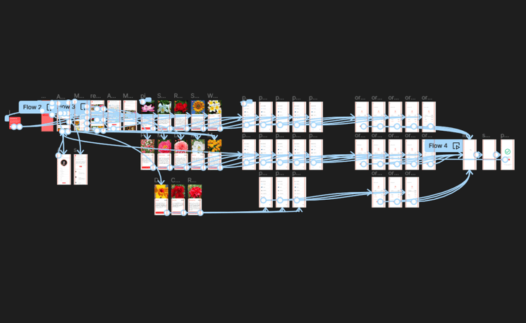
Low fidelity prototype connected the primary user flow of ordering trending or recommended flowers, so the prototype could be used in a usability study with users.
View Trendy Florist: Low-Fidelity prototype
Usability study: Findings
We conducted moderator usability study. In this study it was concluded that most of the users were surprised when there was no confirmation screen before final stage of purchasing. Also, users were having issues for updating their payment information
Findings:

Users want confirmation screen before final purchase

Users want more customization options in location screen


Users want option for changing their payment method
Refining the design
Mockups
High-Fidelity prototype
Accessibility
Mockups
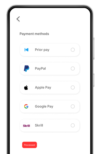
The second usability study reveals the frustration of users for navigating button for updating payment method. We removed it from the profile and added "Prior Pay" during the checkout process. Users can choose to pay with the previous method via prior pay or select from options if they are interested in using a newer one.
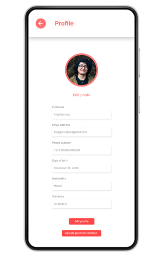

Update payment method button
Before usability study

After usability study

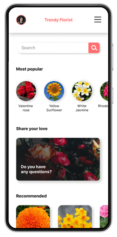
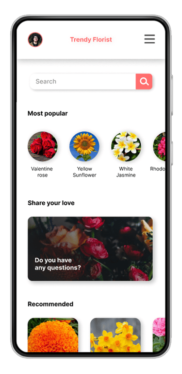
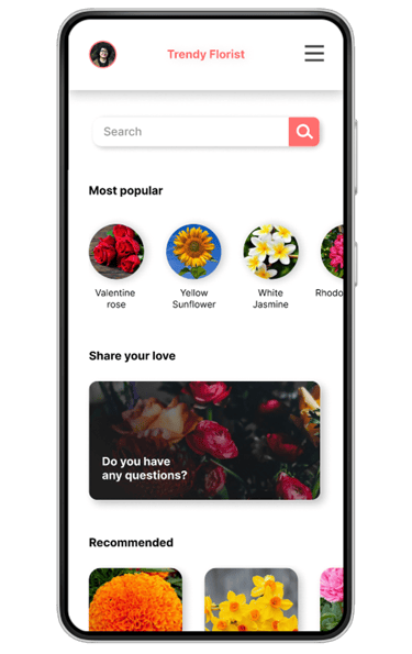
Home
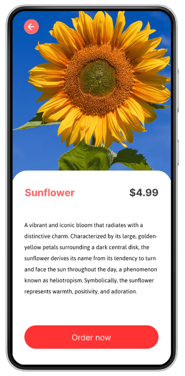
Product detail
Payment method
Recommended products
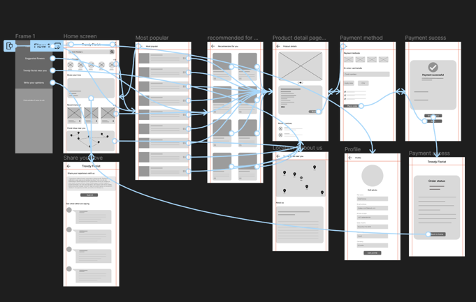
High-Fidelity prototype
High-fidelity prototype connected showcasing the userflow throughout the app
Link to prototype: High-fidelity prototype
Accessibility consideration


All animations on design are under 5 seconds. That means it is not too fast nor too slow
There is contrast between the elements by colors, size and shapes indicating difference between most important elements and least important one
There is consistant navigation across the app ensuring repeated component occurs in same order on each page of app
Design transition video
Here is the video presentation of how the product design transformed from paper wireframe to digital wireframe and then final high-fidelity prototype
Thanks for reviewing