
Wildfire Prediction using Satellite Data
(1-Week NASA Data)
Prepared by: Madan Timilsina
GitHub: madantimilsina3/fire-prediction
Completed on: June 20, 2025
PDF view: PDF document view
Project overview
This project aims to predict the likelihood of wildfires based on NASA's 1-week satellite fire data. Using machine learning, the model analyzes fire history to estimate the risk of fire occurrences in the near future (next week). The project was fully developed using Google Colab and BigQuery, and visualized using maps and heatmaps to identify global fire-prone zones.
Note: Because of having data of only one week, this model was not completely accurate as it locates some areas where there is very less chance of occurrence of forest fire
Data source
Provider: NASA FIRMS (Fire Information for Resource Management System)
Accessed via: Google BigQuery Public Dataset
Data Columns Used: latitude & longitude, acquisition_timestamp, acq_hour, bright_ti4, frp, and fire_count
Tools & Libraries
Google Collab
Google Bigquery
Python 3 (Pandas, NumPy, Matplotlib, Seaborn, Scikit-learn, GeoPandas, Folium)
Step by step workflow
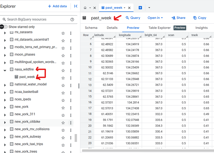
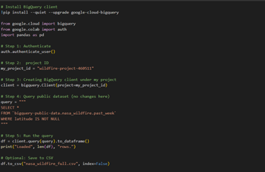
The data was initially queried from the NASA Wildfire dataset using BigQuery. The dataset can be found on NASA wildfire dataset BigQuery. The data consist of 572137 rows as of June 20, 2025. The link for the database table can be found here.
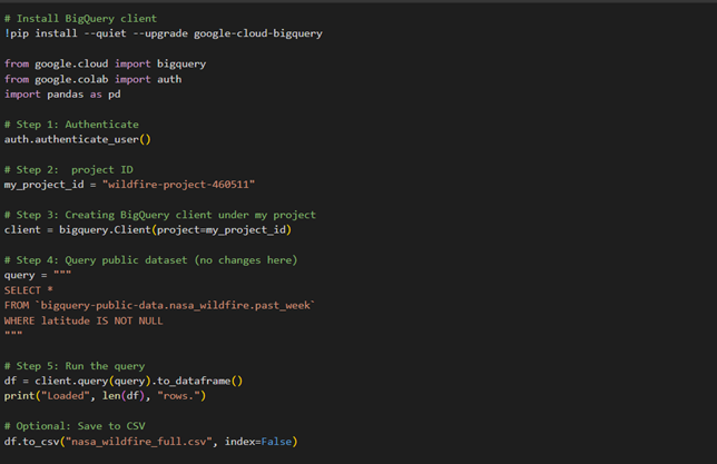
The first cell on the Google collab connects the Google's BigQuery platform to access NASA's public wildfire dataset. It authenticates the user, sets up a project environment, and runs a query to retrieve only the wildfire records that have valid latitude information. Once the data is fetched, it is loaded into a table-like format (a DataFrame) using pandas, and then saved as a CSV file.
The preview of BigQuery NASA 1 week wildfire data:
The first cell in Google collab:
Step 1: Understanding the data
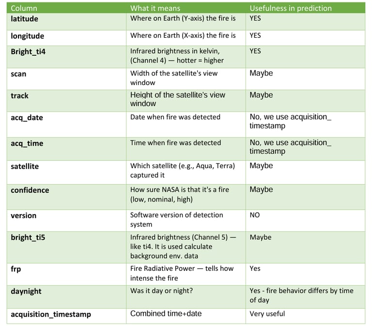
Fire Radiative Power (FRP) is the rate at which energy is released by an active fire. It shows how intense the fire is once it has started. Bright_ti4 stands for brightness temperature. It is measured in kelvin (temperature unit) and generally it increases when there is fire about to happen because fire emits strong infrared radiation.
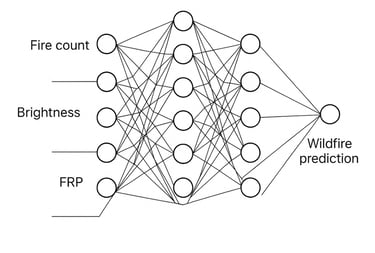
Now I have followed sequence of steps for building this fire prediction model. The steps include understanding the data, defining the problem, data preprocessing, exploratory data analysis (EDA), feature engineering, model building and visualization.
It is important to understand what each of the column in our data wants to convey. The following table gives the brief explanation of each column.
Step 2: Define the problem
Here we should know what actually we want our model to do. In my case I want my model to “Predict the likelihood of wildfire occurrence in the upcoming week using the one week of historical satellite fire data, and visualize the predicted fire risk across global regions through an interactive heatmap”
This problem statement is also known as Fire risk forecasting.
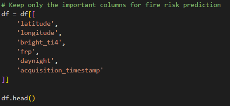
Step 3: Data preprocessing
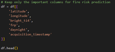
In this step I am going to use the columns that are really important for building my prediction model. Initially the columns mostly I will be using are:
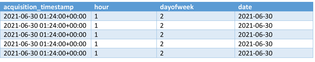
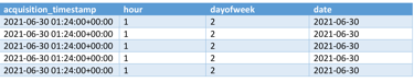
Now its time for extracting time-based features. For that, the new columns that will be added are: hours, dayofweek and date. The hours are used like:
latitude & longitude
bright_ti4
acquisition_timestamp
frp
daynight
1 = 1 AM – 1:59 AM
2 = 2 AM – 2:59 AM
.....
12 = 12 PM – 12:59 PM
13 = 1 PM – 1:59 PM
....
23 = 11 PM – 11:59 PM
0 = 12 AM – 12:59 AM
And it goes like this up to Sunday, but we will be using mostly an acquisition_timestamp and understanding the time concept will be helpful for understanding acquisition_timestamp.
0 = Monday
1 = Tuesday
Next, for day of the week
Next, for day of the week
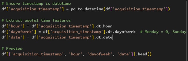
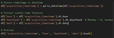
The preview of the code looks like:
Step 4: Exploratory Data Analysis
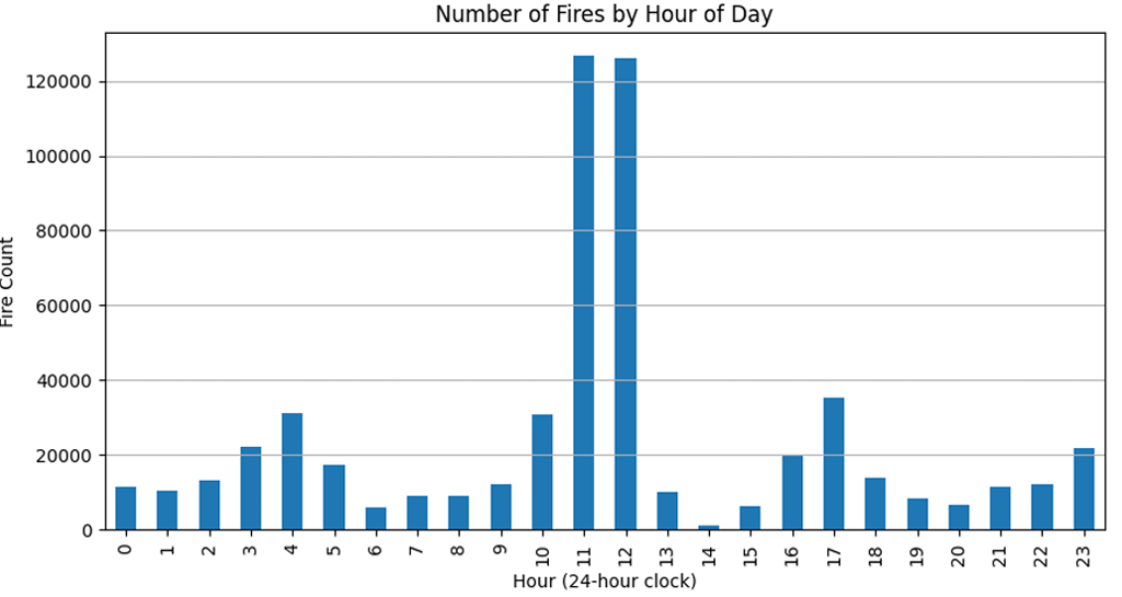
From here we can conclude that most fires occur between 10 AM to 1 PM.
For this, we will try to answer few of the questions like:
Where the fire is happening?
When the fire is active most? (By hours of day)
Do brightness or FRP correlates with fire frequency?
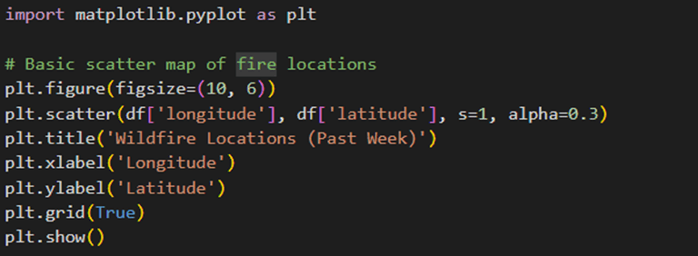
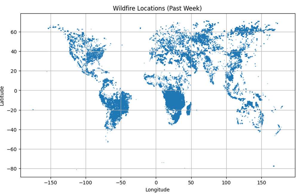
Let’s start with the question “Where the fire is happening based on the data”. Since the dataset includes the data of past 1 week from all part of the world, we will be using world map to plot the fire in the Google Collab. This will help us to give general information about the places where the fire has occurred in 1 week. We will be importing the python library called “matplotib.pylot”.
Our world map looks like this: (Note that, the blue dots are the places from where the data are included which represents the fire occurrence, but I don’t know why there is very small blue dots near the area of artic and Antarctica where it is unlikely have forest fire)
Now let’s move to our next question which is “When the fire is active most? (By hours of day)”. For that we will be using bar graph that will show in which hours there will be more fire. It will solely based on the fire frequency.

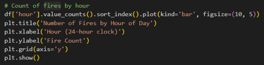
The bar chart given by code:
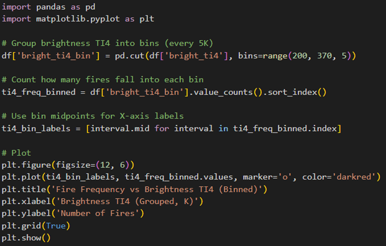
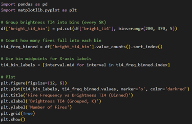
The final question is “Do brightness or FRP correlates with fire frequency?”. There are lots of data and if we try to plot all of them on line chart then it will look messy, so I will be grouping (binning) the data and then plotting into line chart. I will be doing separate for brightness and fire frequency
Do Brightness Ti4 correlates with fire frequency
The line chat as output:
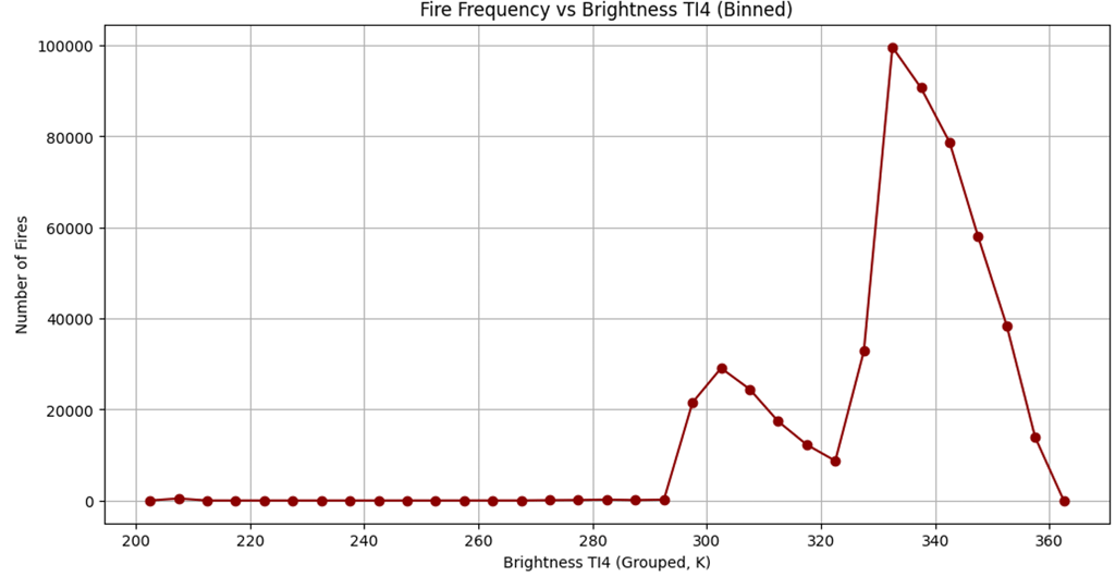
From this chart I cannot say whether the brightness is linked with fire frequency
Do FRP (Fire radiative power) correlates with fire frequency?
The line chat as output:
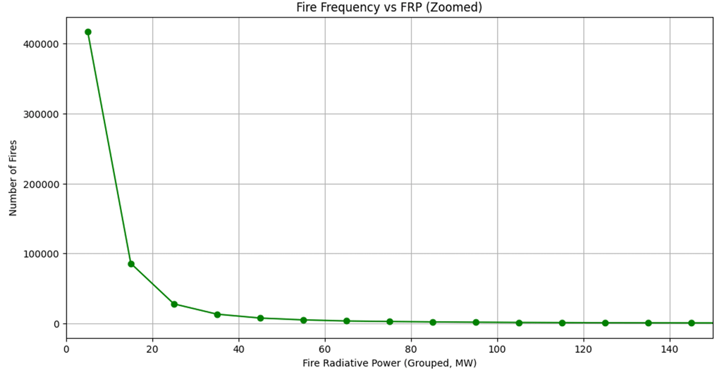
It is obviously true that an increase in Fire Radiative Power (FRP) indicates a larger wildfire. Since large wildfires occur less frequently, higher FRP generally corresponds to lower fire frequency.
Step 5: Feature Engineering
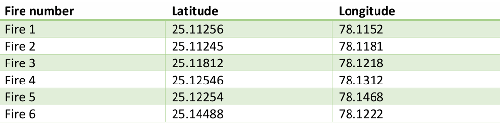
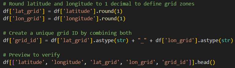
Location based clustering is major step in feature engineering for this prediction model. The fire zone areas are grouped by rounding off the latitude and longitude. For example, the fire occurred at 6 places:
Now grouping all these into a single zone by rounding off the latitude and longitude. Rounding off helps to include all of the fires that happened in same area
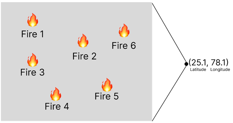
Now instead of saying fire happened at 25.11256, 78.1152 at 1:23PM (This indicates only 1 fire). We say, Fire happened in zone 25.1_78.1 at hour 13 (This indicates whole 6 fires at once). The screenshot from Google collab code:
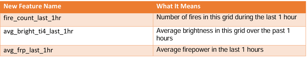
Our second step in Feature engineering is History based feature where we look what happened in the past. For that some the questions are asked and they are:
Did any fire happen in last hour in this grid? (Grid is fire zone that was made by rounding off the latitude and longitude)
Was the temperature rising recently?
Does the brightness was getting hotter over last few hours?
If the answer is YES, then it is possible that fire might happen again soon as it is getting worse.
For answering these some new columns are created that summarize what’s been going on recently in each grid (zone).
We are using brightness ti4 instead of ti5 because it is NASA's primary sensor which is designed to detect fire and hot spots. It is more sensitive to actual fire signals, especially for small and early signals. Brightness ti5 is used to detect surface and background temperatures. It measures the general heat of the Earth's surface (ground, clouds, water). We can think t4 as fire, flame, heat and t5 as land and surface temperature. Now let's move with few steps one by one.
Step 1: Round the timestamp to the hours

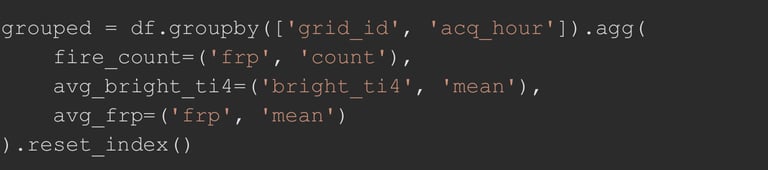
Step 2: Group by grid and hour, calculate summary features
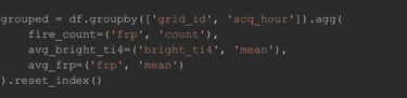
Step 3: Create history-based features (previous hour’s data)

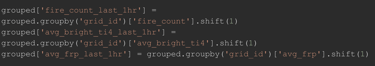
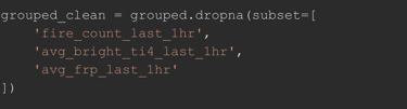
Step 4: Drop rows where there's no previous hour (NaNs)
Step 5: Preview the clean result
The table output:
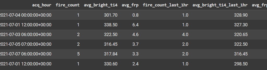
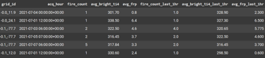
Take a look at row 3: according to fire_count: 2 and fire_count_last_1hr: 4 in the acq_hour: 6:00:00+00:00 (6 AM – 6:59 AM) there were 2 fires in 6:00:00+00:00 (6 AM – 6:59 AM) but there were 4 fires before 1 hours of that acq_time which is 5:00:00 + 00:00 (5 AM – 5:59 AM). This is same for others such as avg_bright_ti4_last_1hr and avg_frp_last_1hr.
Step 6: Model training & building
From history-based features data, 80% of rows were used for training purposes and remaining for testing. So, how the training works and what model learns while training?
The model learns from 80% of rows by:
1. Analyzing the past present linkage
It examines how the data from the past hour (e.g., fire count, brightness, FRP at 3 AM) correlates with the situation in the current hour (e.g., conditions at 4 AM).
2. Identifying Present-Future Relationships
Crucially, because the training dataset includes data from the futures also, the model also learns how the conditions in the present hour (e.g., 4 AM) and the preceding hour (3 AM) are linked to events in the subsequent hour (e.g., fire occurrences or intensity at 5 AM). The data from 5 AM are also available so it can learn and find patterns.
3. Factor Importance Identification
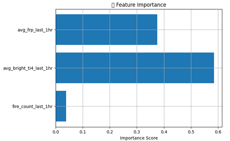
By observing these patterns across a vast amount of historical data, the model can determine which factors (like avg_bright_ti4_last_1hr and avg_frp_last_1hr) are most influential in predicting future fire events. Essentially, it learns the signatures or precursors that most reliably lead to fires in the next hour.
The model's ability to "see" the complete timeline during training – what happened in the past, how it connects to the present, and what subsequently occurs in the future – allows it to learn the complex interdependencies and predictive relationships between these variables. This comprehensive view enables it to identify the strongest indicators for forecasting future fire incidents. For this model avg_bright_ti4_last_1hr and avg_frp_last_1hr were better indicator to identify the future fires as shown by feature importance chart

During the testing phase, the model utilizes the remaining 20% of the dataset (rows not seen during training). It applies the knowledge and patterns learned from the initial 80% training data to predict future outcomes for this new, unseen data. This process evaluates how well the model generalizes its understanding of the links between past conditions and future events to previously unobserved situations.
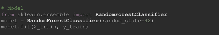
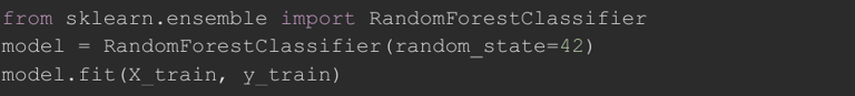
Here the model is known as RandomForestClassifier

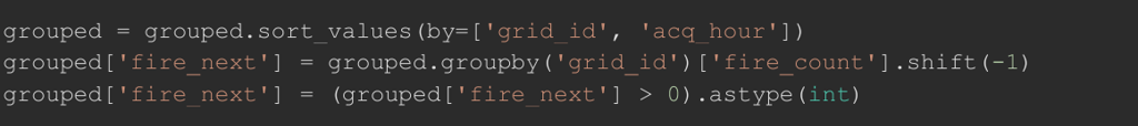
Step 1: Sort and shift fire_count to create fire_next (future fire indicator)
Step 2: Drop rows with missing history-based features
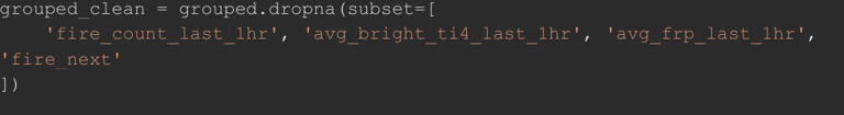
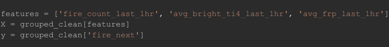
Step 3: Define features and target
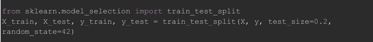
Step 4: Train-test split
Step 5: Building model
Step 6: Prediction
Step 7: Feature Importance (Chart that shows which indicator is crucial)

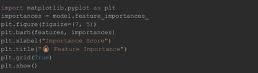
Feature importance chart was already presented above.
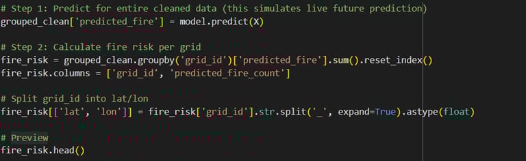
Using hourly wildfire activity data from the past week, a model has been developed to analyze patterns and predict the likelihood of fires occurring in the upcoming week. The model (RandomForestClassifier) was trained on hourly historical features (X_train) to learn patterns that lead to fire (y_train). Then that trained model is used to aggregate predictions by location (grid_id) to simulate total fire risk for the upcoming week.
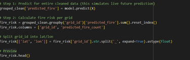
In very simple words: I built a Random Forest model using 1-week hourly wildfire data to predict fire occurrence in the next hour, and then aggregated those predictions to estimate the total fire risk for each location in the upcoming week.
Final step: Visualization
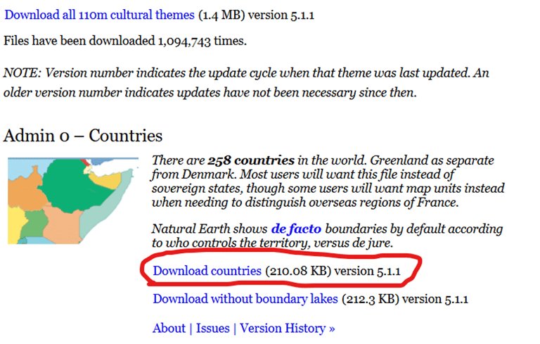
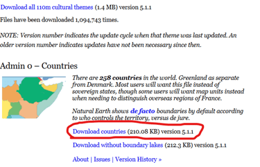
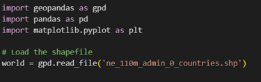
It is important to present the findings to people in an easy understandable way, so the visualization is last but very important step that shows where the fire might occur in next week. For presenting the data in the world map I have downloaded files from Admin 0 countries from the Natural Earth. The link for the download: Natural Earth » 1:110m Cultural Vectors - Free vector and raster map data at 1:10m, 1:50m, and 1:110m scales
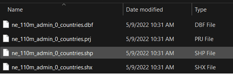
After that we extracted and uploaded 4 files from that to Google collab to plot our next week fire prediction in world map.
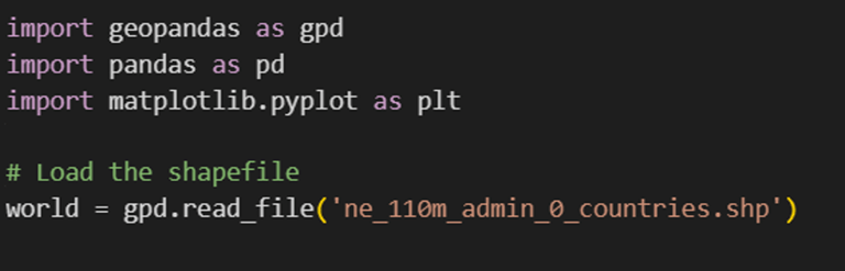
Then geopandas was installed:
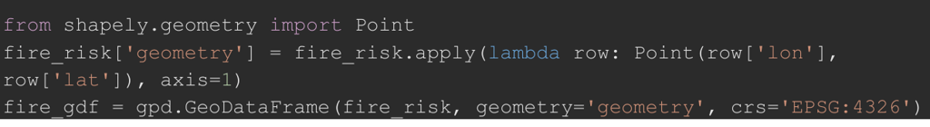
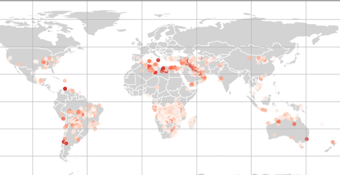
Then the latitude and longitude values from each row in the fire risk data are used to create geographic points. These points represent the exact locations on the map where fire risk has been predicted. This step is done to prepare the data for mapping and visualization.
Finally, a world map is created, and the predicted fire risk locations are plotted on it using red-colored dots. The color intensity of each dot shows how high the fire risk is at that location — darker red means higher predicted fire count. This helps visually identify which areas are more at risk of wildfires in the upcoming week.
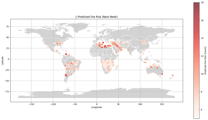
I am sorry for the blurred image, but you can view clearer image on the PDF version of case study: here
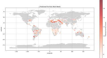
The zoomed map where there might be possibilities of fire occurrence in next week:

Note: ChatGPT and other AI tools were used as supportive assistants throughout the project